Small modernish interior scene

Author Topic: Small modernish interior scene  (Read 2336 times)

i was bored and just felt like building whatever, so i decided to make a small interior based on an old drawing of mine
it's just the little scene itself, i might turn this into an actual build sometime


the original drawing:

ratings and stuff are welcome i guess, i just felt like sharing this since i haven't built a whatever in a while

Pretty nice. Matches the model quite well.


8/10 I like it. It maches the picture.

Just need to put a little dark color on the tv stand and wood.

Oh and you might forget the wooden wall on the back with the window.

But good job keep on going

Oh and you might forget the wooden wall on the back with the window.
the wha

the wha

he means the brown curtains in the back right, next to the window.

he means the brown curtains in the back right, next to the window.
but they're there

but they're there

I meant that its not brown like shown in the real picture

decided to start expanding outwards, focusing just on the interior of this living room thing so far

basically just got a floorplan for now, we'll see where i go with this i guess
i think i might use other interior drawings of mine for other rooms, we'll find out eventually

oh that picture from that adventure

make new art already

You are literally the first person I've seen to use my Portrait Prints in the way I intended them to be used.
I am so glad it's being used.

You should totally finish the room.

Eh, I'd say 6.8/10, theres just something that I don't like about it but I can't quite put my finger on it, But don't get me wrong it looks pretty damn close to the picture, it also looks a little good.

I'm seeing that TV brick often in most builds I see, can anybody direct me as to where I can obtain it?

ON TOPIC: It looks really nice, I really like the TV and the paintings, vaces, etc.

All in all, its a small, but impressive build. My favorite types of posts in gallery. Good job. 9.5/10

As a huge fan of modern architecture, I really like this. 9/10. Only thing I would change is MAYBE the floor to some hard wood. Other than that looks good!

Almost decent, the trouble is you've got the floor, ceiling and walls all the same texture and color. There's got to be some variation otherwise it may as well be a mental asylum. Hard wood floors and a ceiling with more depth and shape would definitely do a lot here, for example:


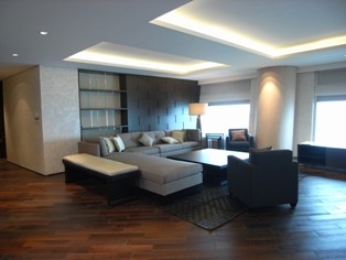
Clear division of floor/ceiling/walls with the solid ceiling being broken up by both the light fittings and the recessed lighting panels.

The combination of visible brick tops and total flat also makes things look a bit awkward. Texture's not a bad thing, you could use tile prints on the couch to give the impression of cushion separations. Using a brick texture for what's meant to be a rug seems misplaced too. A simple dual-tone flat brick rug would do a world of good.

Just a nearby example to demonstrate the effectiveness of texture use:


The back wall of this picture could have been totally flat but the cobblestoned effect adds a new dimension. The floor is a single color but it's been broken up into tile bricks to make it a bit more interesting. I'll see if I can find a few of my older contemporary style builds I've done later.