Show Posts

This section allows you to view all posts made by this member. Note that you can only see posts made in areas you currently have access to.


Messages - MrCookie

Pages: [1] 2 3 4 5 6 ... 349
1
General Discussion / Re: Mr. Wallet's Rise of Blockland
« on: December 07, 2013, 02:49:49 AM »
Are you able to transfer money or w/e between players? Because one income source I really would like to try out would be to sell my building skills, aka building stuff for people for payment.

it'd be like dota lol where ppl funnel all their money to one guy who'll get a huge headstart and destroy the others

2
General Discussion / Re: Mr. Wallet's Rise of Blockland
« on: December 04, 2013, 03:41:32 PM »
Why not make it so people can earn/make resources rather than just wait for them to appear.

plz no i don't want to grind for resources. one of the reasons i liked RoB was because i could talk to other ppl on the server or do other stuff while i waited for resources.


i don't think there was really anything i didn't like with the latest RoB server you put up (with the rating thing), which is why it's my fav server. what I would like to see though would be maybe some collaboration building component (if it's possible without screwing the gameplay) and stock market thing.

PS: the property rating idea was basically the solution to the only problem i had with RoB before

3
Gallery / Re: Modern House (2nd Build) [Image Heavy]
« on: November 02, 2013, 09:08:23 PM »
cute!

4
Raffle me up. I want premium!

5
Gallery / Re: DOF Screenshots
« on: November 01, 2013, 02:18:50 AM »


Picture took by BSoD

Where can I find more pictures of this build?

6
General Discussion / Re: Post/discuss your most favorite server ever.
« on: October 29, 2013, 10:39:23 PM »
Wallet's Rise of Blockland!

7
Gallery / Re: Utopia City - Release page - 100%
« on: October 29, 2013, 04:49:04 PM »
yay A+  :cookie:

8
Gallery / Re: Blockland: World of Houses
« on: December 05, 2012, 03:41:03 AM »
You should really post some pictures instead of these videos. I find it frustrating to have to load up a video, then listening to some funky music while watching the camera move too fast.

Note: I have not read Lordy Lord's or Ladezkik's reviews, but I assume that they are more well constructed than my review and you should take note of theirs' more heavily. I quickly skimmed through the videos to get the gist of the designs of each house.
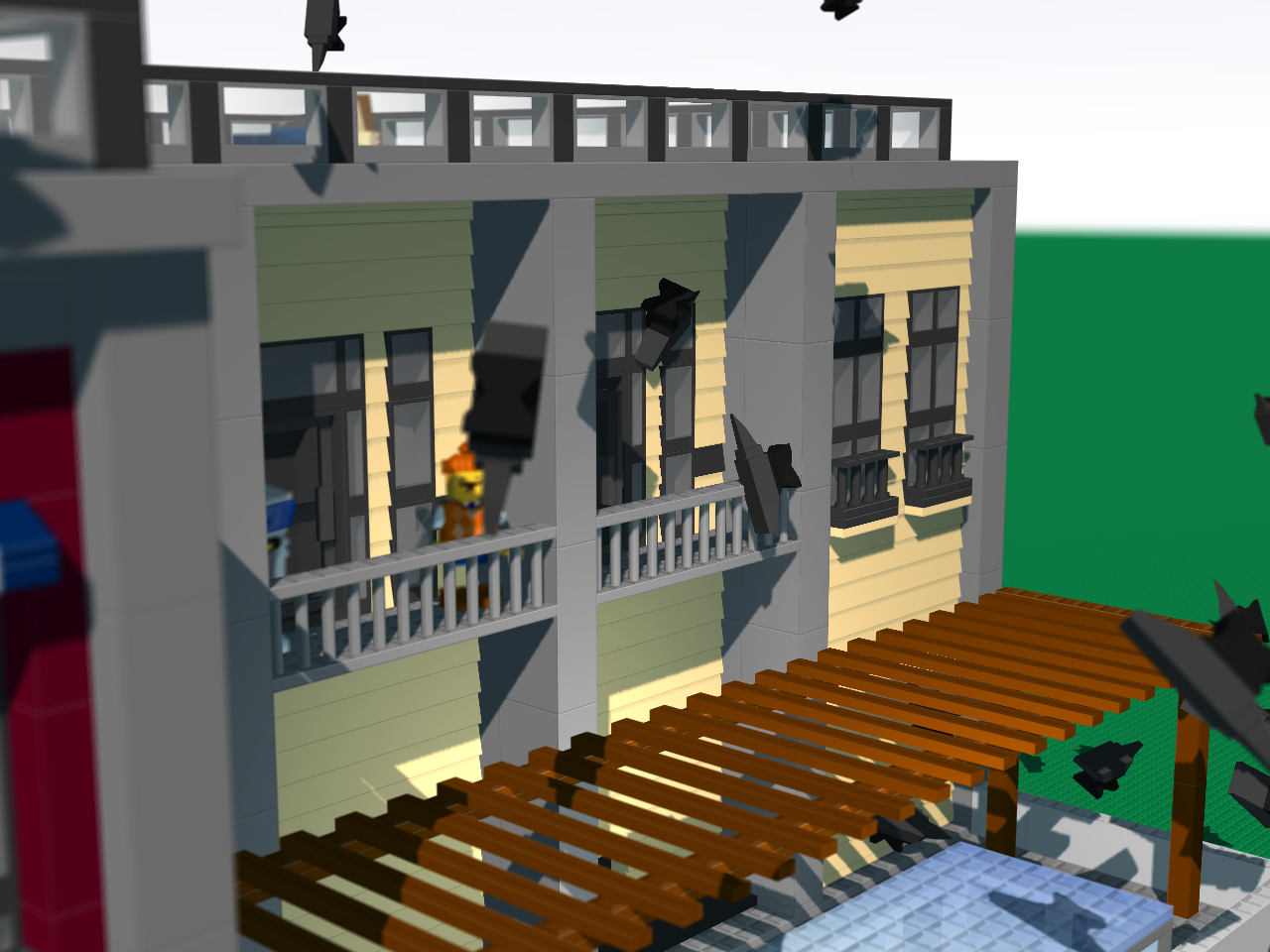
Interior:
All of your interiors need work. The design scheme for all of them are way out of date and in the past. I understand that you were going for a "traditional" look, but the reason why architecture and design has changed is because people have thought of better designs. I do realize that some traditional designs are amazing, and I'm not saying that we should completely abandon traditional design. What I'm saying is the interior designs in the videos have been executed poorly. What stood out exceptionally was the green striped walls in one of the houses. Litmore I believe? The choice in the tone of green was very strong in colour, so it provided a focal point for viewers. The problem with the wallpaper being the focal point is that it's a darker tone of green and it's green. A swampy mood and setting is created with that colour, and I would assume that you would not like to have a swamp in your home.

I don't really have much more to say other than everything looks outdated and old, killing the feeling of life and freedom - the feelings which one should be aiming for when thinking of an interior design for a home.

Exterior:
I think the exteriors look nice though, but lack of a "hook". A "hook" is similar to something you would write on an essay; it's something which catches the viewer's eyes. It makes you different from every other house that's been designed. A hook captivates a viewer's interest.

I apologize if this reply is hard to follow. I was typing this with scattered thoughts and opinions.


Pretty damn legit, as to the original buildings.

MrCookie should get in here and offer criticism. I dunno if any of us regular gallery-goers can offer any real good criticism.

You should PM me if you want my criticism; I don't frequent the forums much anymore. :)

9
Gallery / Re: my Blockland house best one i made
« on: December 05, 2012, 03:19:07 AM »
Looks great! I suggest challenging yourself by adding an attic level - with windows - to the house. Adding window protrusions to the roof will give the roof more of a shape to it, providing a more interesting and less plain look.


10
Gallery / Re: Wooden Cabin - Camping RP
« on: November 19, 2012, 03:07:11 AM »
Here is some constructive criticism because it seems there's not much being given to you.

  The front facade is very well designed with the mixture of stone for the base and wood for the main floor. The exterior colours blend well with each other and provides a royal feel to it yet maintaining the cabin feel. The front exterior may look fantastic, but the rest of the build does not.

  There is no transition between the striped wallpaper and the plain coloured wallpaper. To add to the mess, the striped wallpaper towers over all the furniture and even reaches to the top of a door arch. The use of such a strong tone of blue in the blue room creates an unappealing contrast between the colours of the furniture and the colour of the wall. Don't use striped wallpaper unless you know how to do it correctly. Most people don't.

  The furniture throughout the interior looks fantastic and provide a realistic look. Job well done on that. The furniture looks nice, but the rooms don't. Each room is far too spacious and it looks like every piece of furniture is its own continent, very detached from the others.

  The back has no design to it at all. I understand that it's easy to be inspired and create an amazing front facade and lose all motivation and inspiration to design a beautiful back in the process.

Although there are many faults in your build (specifically the interior design), it's a lot better than most peoples'!

11
Gallery / Re: Tank House
« on: November 04, 2012, 01:23:41 AM »
ahahaha this is great

12
Creativity / Re: The new and improved 3D model topic!
« on: November 04, 2012, 01:18:23 AM »
i suck at rendering

18 mins


16mins


28mins


blurred parts are my school name

13
Creativity / Re: The new and improved 3D model topic!
« on: September 26, 2012, 02:05:25 AM »


(click for full sized image)

14
General Discussion / Re: Buildmode - A semi-competitive building game mode
« on: September 08, 2012, 07:18:40 PM »
screenshots:


15
General Discussion / Re: Buildmode - A semi-competitive building game mode
« on: September 08, 2012, 07:06:37 PM »
Like most building servers this is usually empty. :(

this is why i stopped working on it last time.

Pages: [1] 2 3 4 5 6 ... 349