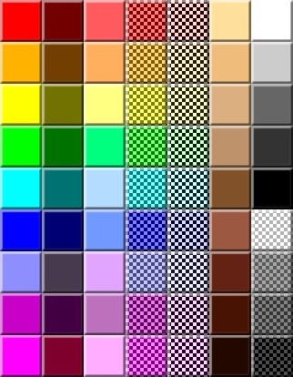
nitpicks:
personally not a fan of the neon colors
orange in the first column is a tad too yellowish
whats with the nearly identical pinks in the first column (8 and 9)
personally think the dark orange in the second column is unnecessary
whats with the nearly identical pinks in the third column (7 and 9)
why are there 2 columns completely devoted to transparent colors
whats with the nearly identical pinks in the fifth column (8 and 9)
contrast in the brown column is wonky
personally think the super dark brown at the bottom is unnecessary
grayscale column loses brightness very abruptly from 2 to 3


