Author Topic: Empire Tower working thread. [WIP] Check most recent page for updates.  (Read 20520 times)

LOOK OUT!

Another picture!


LOOK OUT!

Another picture!


The windows fail it looks like its an old grandpa crying!

LOOK OUT!

Another picture!
-snip-
Lol looks like a crying mime

Alright, tee hee, we've had our laughs. As soon as a respected member of this community states that he doesn't like the windows, I'll change something, but for now they're staying.

Alright, tee hee, we've had our laughs. As soon as a respected member of this community states that he doesn't like the windows, I'll change something, but for now they're staying.
What, im not respected?

I think it's pretty cool. Although the fact that the picture itself isn't symmetrical is gonna aggravate me to no end. D:

Alright, tee hee, we've had our laughs. As soon as a respected member of this community states that he doesn't like the windows, I'll change something, but for now they're staying.

okay, they look terrible, make the front facade look like a face, and have no sense of positioning or proportion.

also I'm going to be dead honest, your build looks like a hodgepodge right now.  Pretty decent in terms of technical brick placement, but you have like 5 or 6 architectural themes in there already and you're only on like the third floor.  In order to make your build look cohesive, you need to put variations on already extant themes (like the diagonals that frame the doorway) throughout the build instead of creating new ones.  Also, if I were you I'd mute my color scheme.  I lived 5 blocks from the chrysler building for the better part of three months, and in person the black is very minimal; what stands out is how the black breaks the predominantly crisp white of the facade.  You seem to be going for half and half, which is ultimately not very kind on the eyes.


afkpuz whats your id?

Lookin good. I just love the color scheme for some reason.


okay, they look terrible, make the front facade look like a face, and have no sense of positioning or proportion.

also I'm going to be dead honest, your build looks like a hodgepodge right now.  Pretty decent in terms of technical brick placement, but you have like 5 or 6 architectural themes in there already and you're only on like the third floor.  In order to make your build look cohesive, you need to put variations on already extant themes (like the diagonals that frame the doorway) throughout the build instead of creating new ones.  Also, if I were you I'd mute my color scheme.  I lived 5 blocks from the chrysler building for the better part of three months, and in person the black is very minimal; what stands out is how the black breaks the predominantly crisp white of the facade.  You seem to be going for half and half, which is ultimately not very kind on the eyes.

In all honesty, even though you've ripped what's so far my masterwork a new starfish, this is the kind of response I've wanted. Not to fault you, but this is what I needed when I could've more easily done something about all the points you brought up.

Believe it or not, I did plan most of this and thought through a lot of it. I probably should have thrown together several drawings before deciding on a final design, in fact, I fault myself for not asking for feedback on the drawing before starting.

As for some of the planning stuff, here's a drawing I did around the time that I was halfway through the first grouping of three floors.


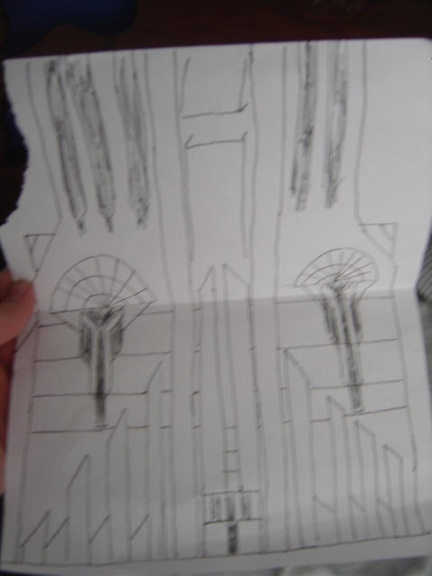
As you may or may not be able to see, a good bit of this was thought through in a way not necessarily presented in the first drawing. I did recognize that the facade was rather bland and I did what I could to break it up. In a way, there's differences between just making something that looks cool to break up the bland white exterior, and making something visually consistent with the rest of the build.

As for some of the 'architectural styles' you mentioned, could you list some? I fail to see how I have 5-6. The whole building is rather vertically oriented, being broken only by the bands of black, which are admittedly have somewhat odd placement.

It might be a little late to start fresh, but that doesn't mean I'm not open to drawing new things and seeing what you guys think.

I'd hate for all of this work to go down the stuffter, but you were rather vague. I'd like more pointed remarks on specific elements before I change anything besides the windows.

I must say, that it DOES look like sombody weeping
but, it isn't rly that bad.
It kind of adds to the place realy.

:/

It does look like a crying mime.

:/

It does look like a crying mime.
I said I'll change it.

Stop.