Author Topic: Digital Art Megathread  (Read 9255 times)

Inspired by dorkdotdan's Censoredland logo for Blockland, i made my version look more like Blockland's logo


A picture made for TeslaCoil's Jurassic Block topic


Inspired by Djy1991's promo video for ICTON's Davidfield video


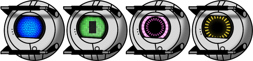
My apparently-popular-on-DeviantArt picture of the four personality cores from Portal 2, it's my most popular picture on DeviantArt i think


I believe some of you will remember this, but anyway, it's the Gman pretending to be Phoenix Wright


Blockland version of Newgrounds' logo


Overall, this was good, but the lines are quite sloppy, i actually plan on remaking it in Photoshop


RED Team version of the above picture and with a different quote


the topic I made for this got two replies so I don't see the harm in posting it again.

That is ... woah.

Here is an avatar I made for one of my friends. (Dammit, Photobucket. It won't let me addupload the other one)
http://forum.blockland.us/index.php?action=dlattach;topic=182750.0;attach=164830;image


Sorry about the BL avatar Gir having no pupils.
http://i1220.photobucket.com/albums/dd450/dargereldren/GirAvatarBlocklandForums.png
Feel free to use it as an avatar.


This is the image it was based off of.
http://i1.squidoocdn.com/resize/squidoo_images/-1/lens17754440_1300383709GIR_with_cupcake.jpg

Edit: Now that I think about it, this is kinda weird and messy.

Edit 2: I ended up putting this in the wrong thread. I'm not going to bother putting it in the Drawings Megathread, though, since this is old (and stupid).
« Last Edit: April 06, 2013, 02:18:40 PM by dargereldren »

So i decided to remake those two Soldiers i did and totally not overusing the Bevel blending option


(a white one just to be patriotic)


Hot soldiers.
indeed, but the lines are a bit iffy.

I think if they were merely a darker colour of the colouring they reside it would seem a bit less icky


Logo you can use for the topic. I don't mind if you don't.


Logo you can use for the topic. I don't mind if you don't.
well I'm an ass

« Last Edit: January 21, 2012, 07:55:36 PM by Supreme Guy »

indeed, but the lines are a bit iffy.

I think if they were merely a darker colour of the colouring they reside it would seem a bit less icky
Eh, these felt like they were more trouble than they're worth


But do they look better nonetheless?

Eh, these felt like they were more trouble than they're worth


But do they look better nonetheless?
Indeed, not quite what I was thinking of but it still looks really nice.
« Last Edit: January 21, 2012, 10:54:29 PM by Supreme Guy »

The colored outlines on the teeth look weird

CURSE YOU PHOTOSHOOOOOP!!

A little something I made for Extrude's game. With the surprisingly rare power of common sense and URL editing one might catch a glimpse of the full resolution version of this image.

« Last Edit: January 22, 2012, 06:22:06 AM by Demian »

A little something I made for Extrude's game. With the surprisingly rare power of common sense and URL editing one might catch a glimpse of the full resolution version of this image.
http://img.dataorb.net/cartoony_earth.png for the lazy

A little something I made for Extrude's game. With the surprisingly rare power of common sense and URL editing one might catch a glimpse of the full resolution version of this image.

[img  width=800]http://img.dataorb.net/cartoony_earth_small.png[/img]

Looks waaay too detailed for his game.