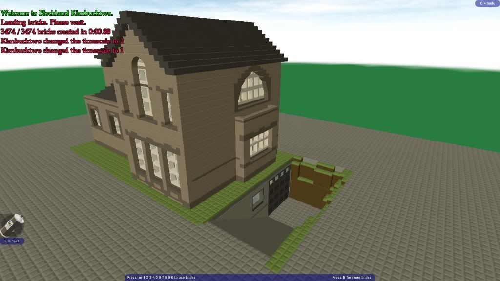
I was on Red_Guys RP (which never has enough people on... join it -.-) and was building a house. about 3/4s i was crashing continuously (not because of the server), so i saved what i had and finished it offline.
It's probably the biggest house I've ever made, and its rare that i ever complete houses with 2 floors, because of boredom. It's a bit darker than i would prefer because of the bright lighting on the server, and the back is blank because of the terrain that was behind it on the server.
But here it is:
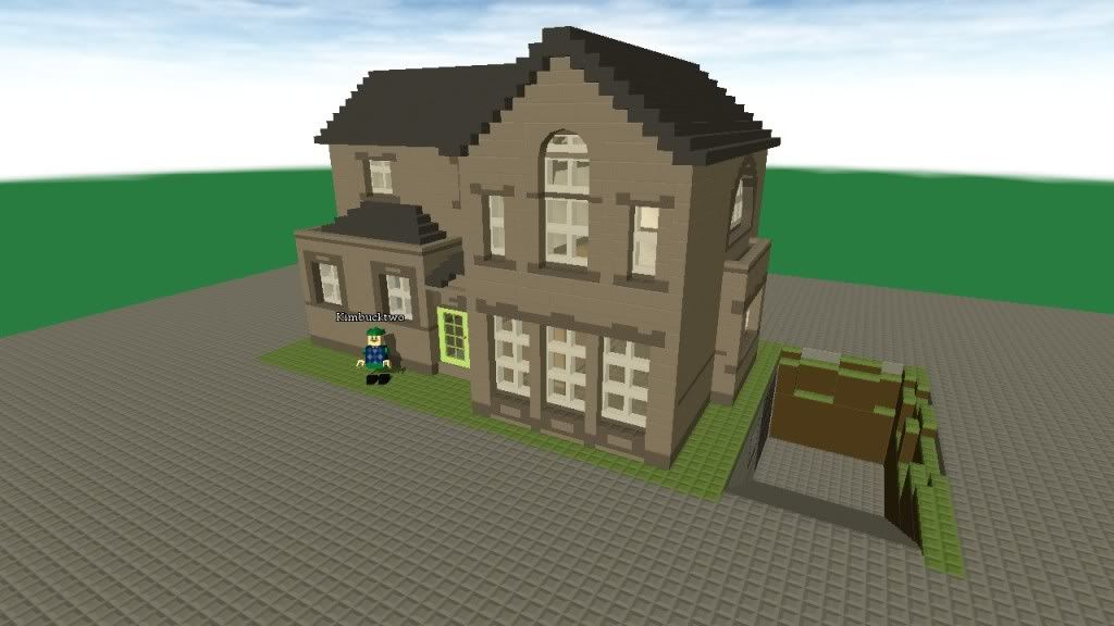
Front
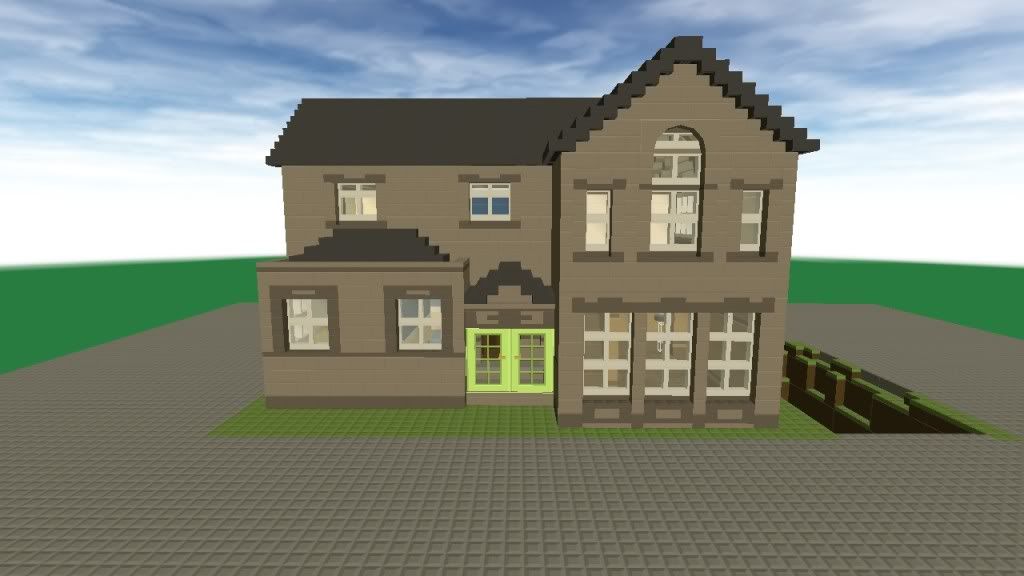
Front again
Front/side
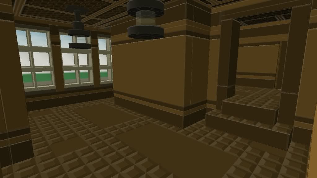
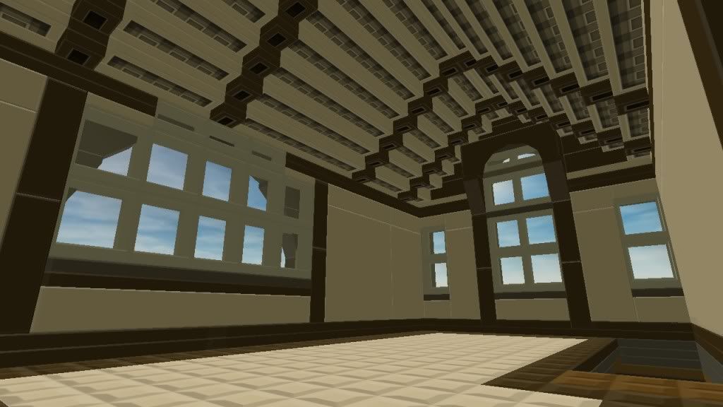
Living room (was the only place where i could put the stairs, it looks out of place there :/)
Upstairs
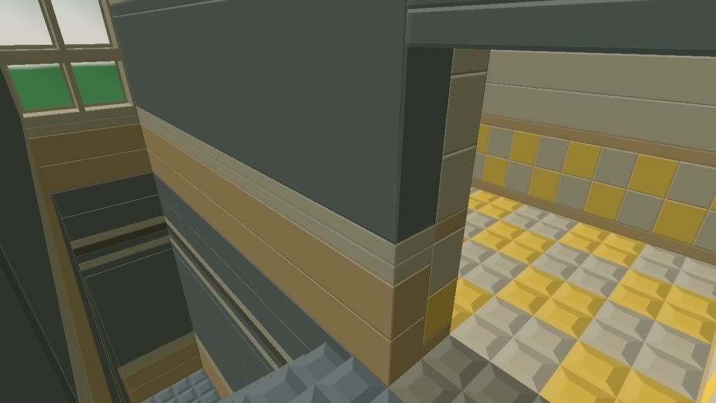
Kitchen and steps to downstairs
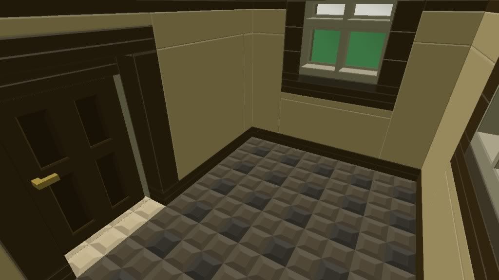
Bedroom
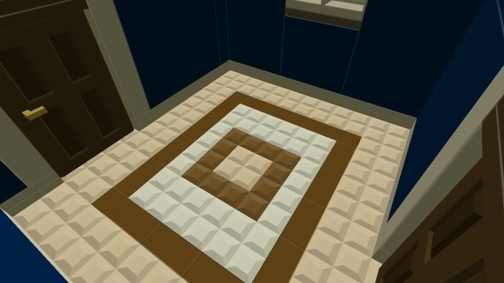
Study
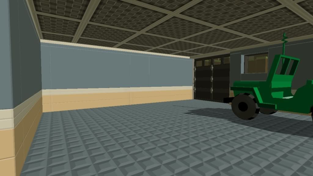
Garage
feel free to rate x/10
If you got it, advice is appreciated :D


