Author Topic: Halo CE's Pillar of Autumn Bridge (Interior only)  (Read 8158 times)

I've always been into Halo, mainly for the long storyline that plays out perfectly, but also the small things like armor detail, ship classes, other planets even.

The POA is my favorite ship among the UNSC fleet, particularly because it's not just the first important location you start out in the whole gaming series, but because of it's history beforehand, it's selective characters that ended up on it, and the general architecture of it.

Since of course building the whole ship's exterior, would be a hassle (I'll eventually feat once modter works inside zone bricks) I've settled for something a little smaller; The Bridge.

The bridge is the most important part of a ship because it is where the controls are, the brains basically. It's the first location in Halo CE that you receive your AI (Cortana) and it's also the first place you talk to a higher ranking officer (Captain Keyes). Not only do I love the story and gameplay, but also the feel of the bridge. It's surprisingly small compared to the rest of the ship, which makes it pretty unique.

I tried hard to replicate what I could from the Pillar of Autumn model on Garrysmod, since I lack the original game to do a comparison. It's just the interior of the bridge.
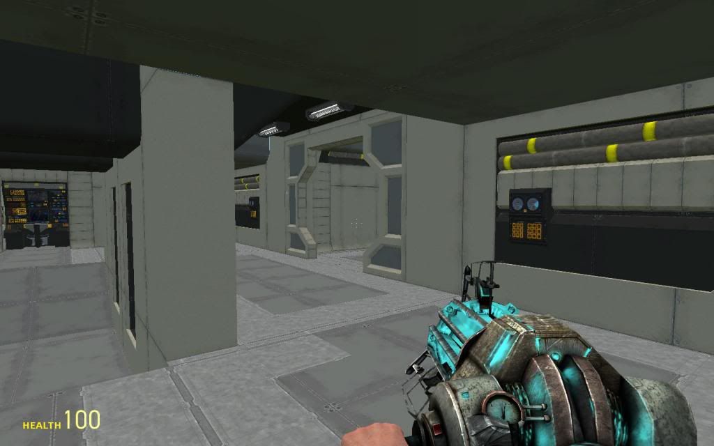
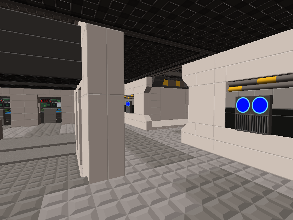
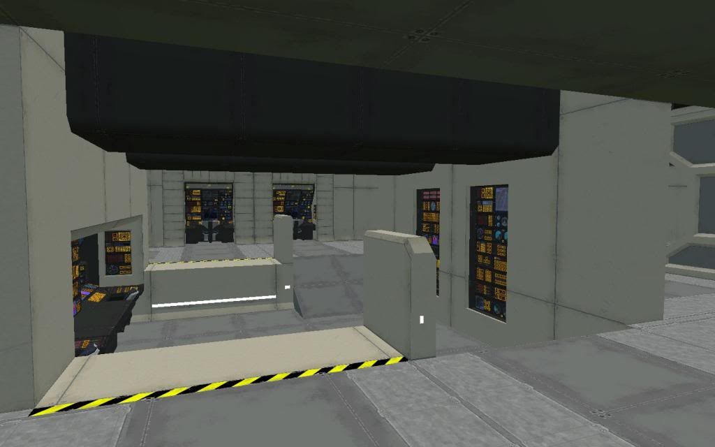
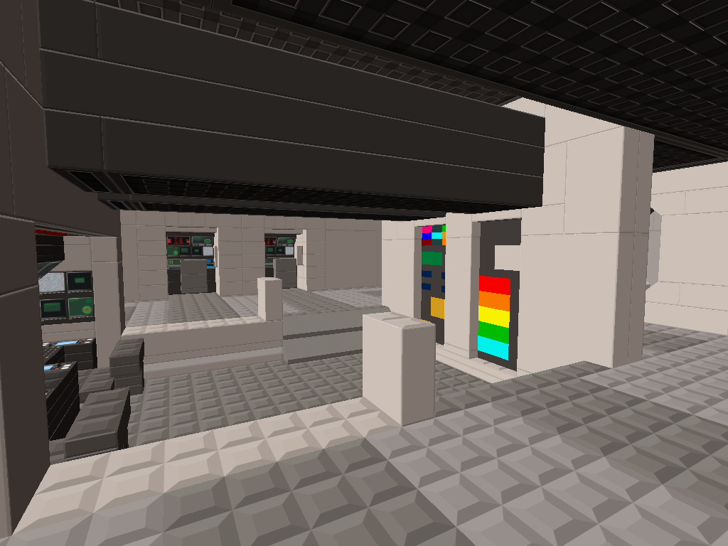
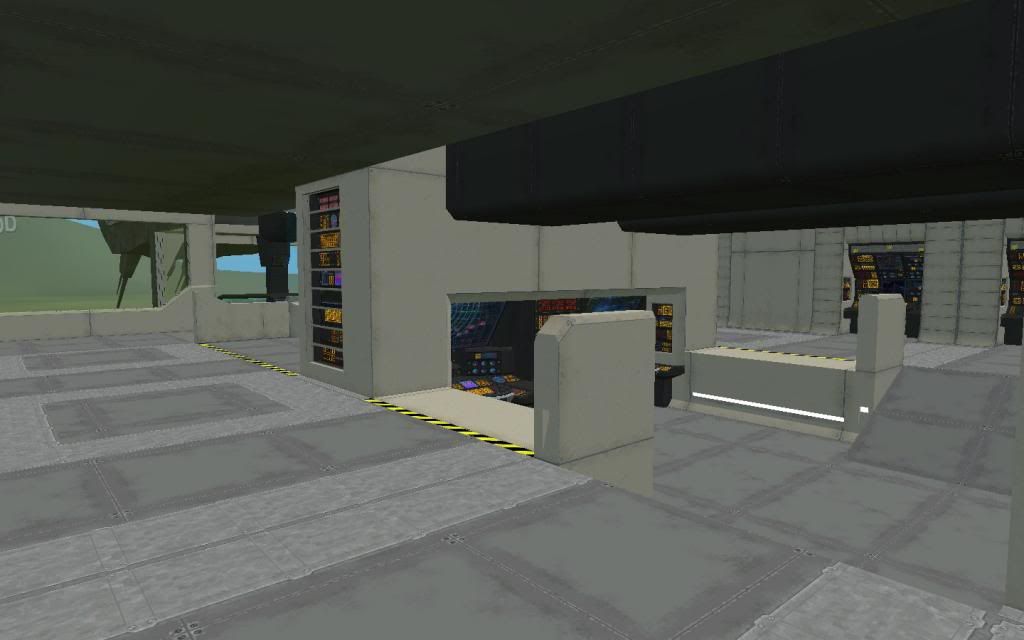
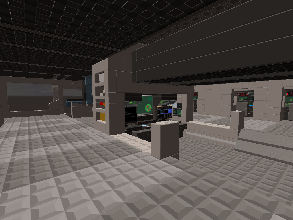
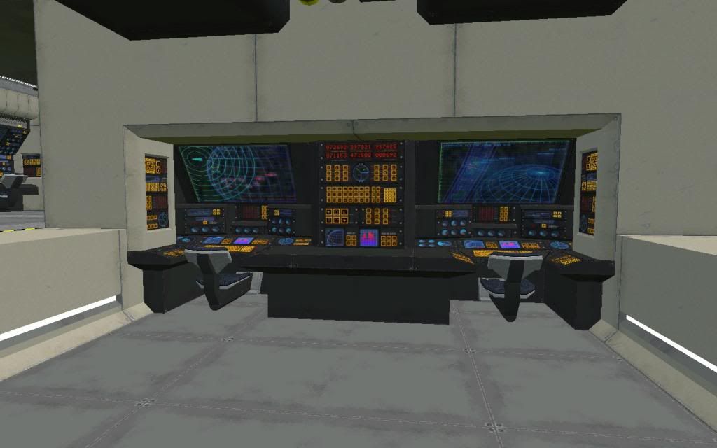
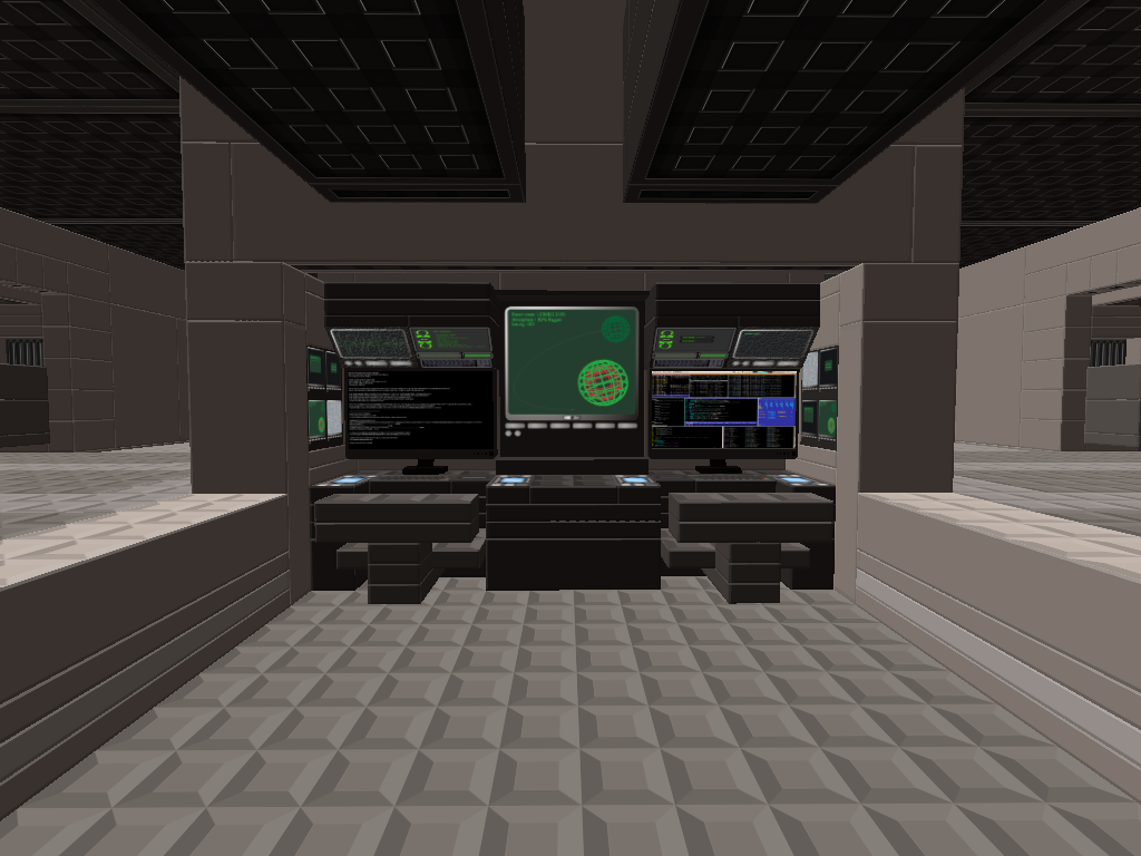
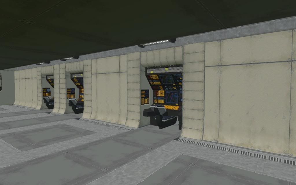
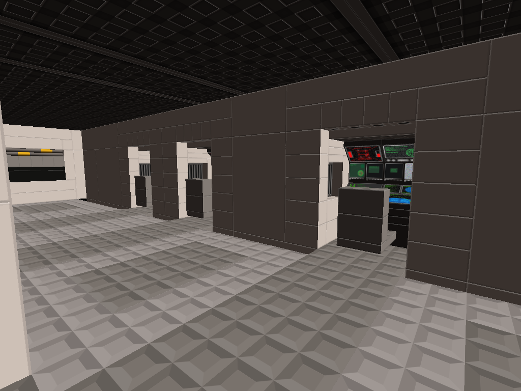
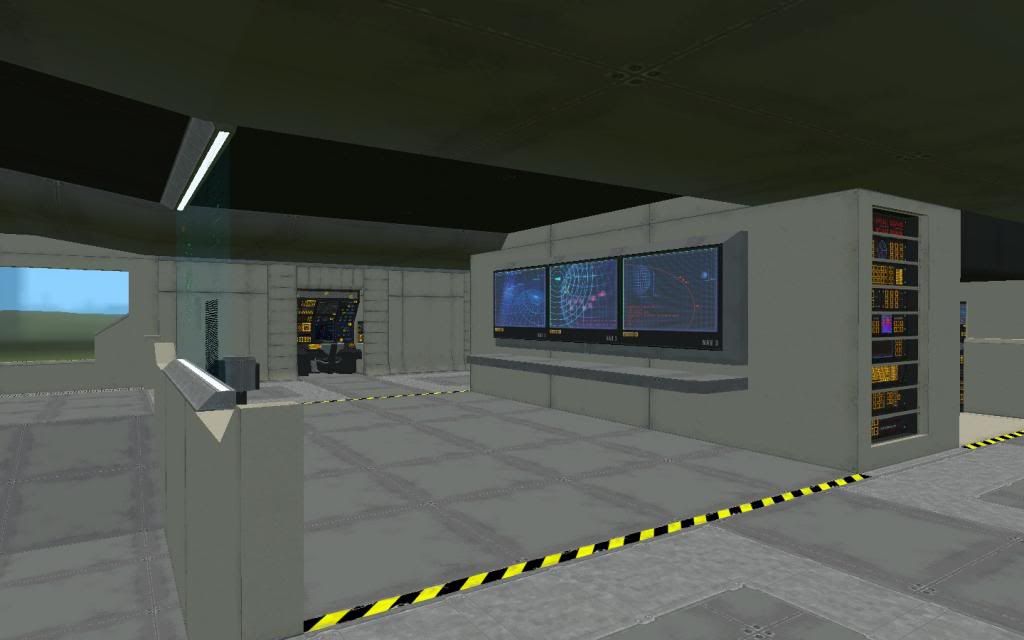
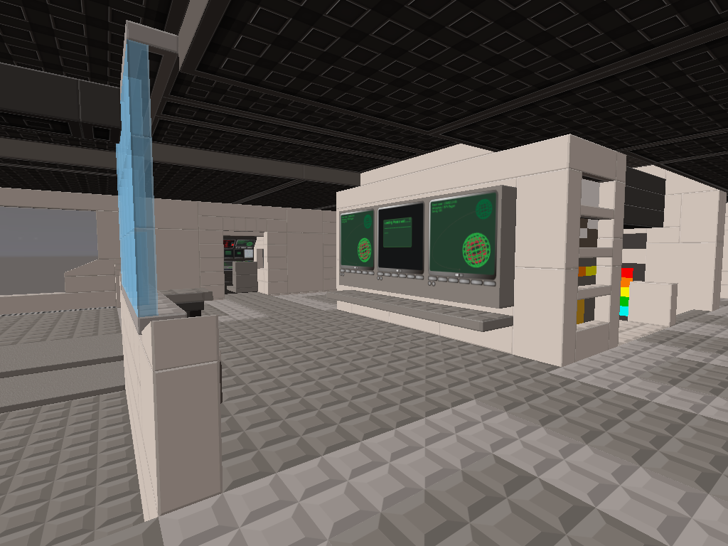
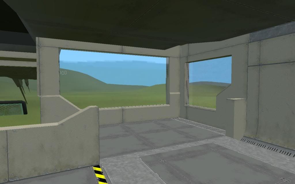
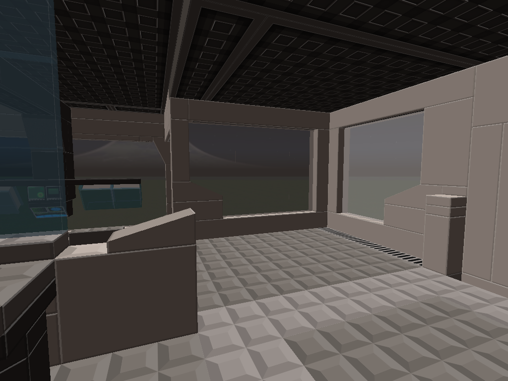
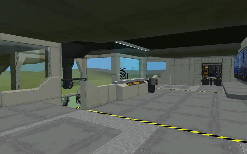
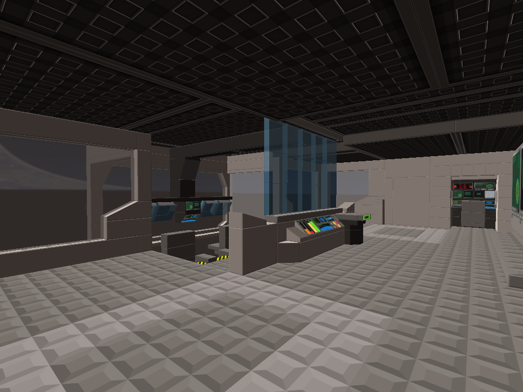
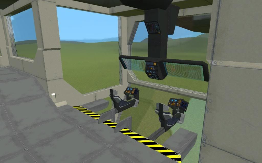
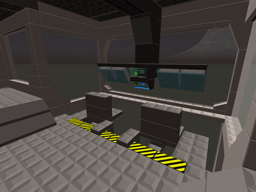
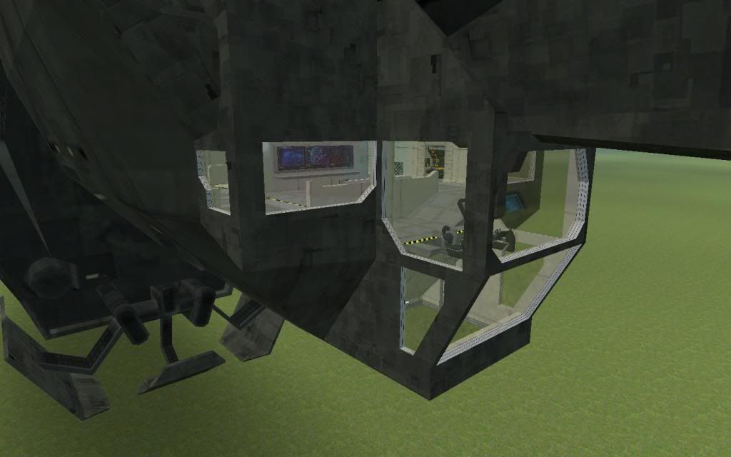
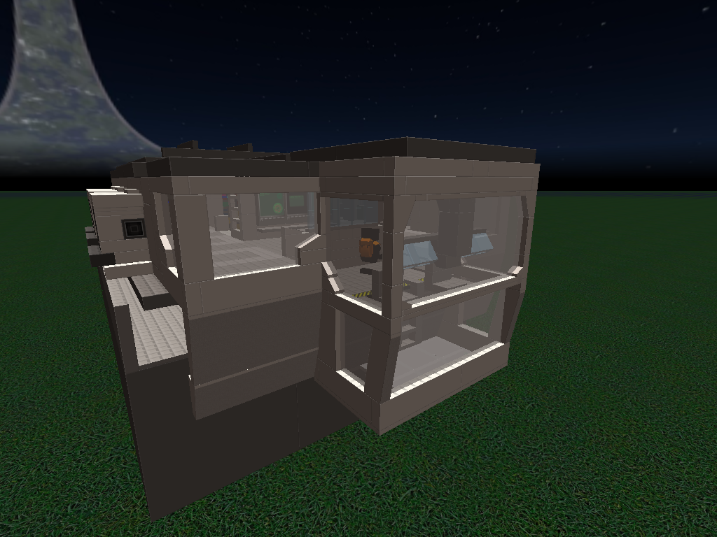
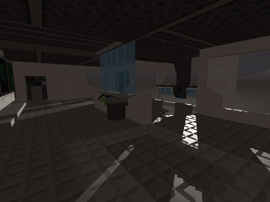


I did the pictures with no shaders on because I wanted to have "light" inside, unlike the last picture. I could have ran it on Min. but my computer doesn't like that, I was able to take a shadow shot. My computer can run shadows, but it just drops the FPS like bass. There's also a lack of good computer screen and other sci-fi prints for vertical bricks and such.

But here is my build! It's just interior, don't really expect more from it unless I decide (and modter + zone fix) to do something more! You may rate!


Not that bad. 8/10
Thank you.
tips for improvements? I could have make the whole scale bigger so I could fit more detail at least.

tips for improvements?
Add more of the black and yellow warning stuff on the floor where appropriate.

saw a line of 1x1s that could have been replaced by 1x4

Might be spammy, but if you're not recreating a lot then it won't be a problem, but I would recommend some custom print-brick decals.

Something you can use for the floor, to give it that Steel-Plate look and texture, as well as make the floor design more obvious.
I like what you've done in copying the design in using two colours, but because they have the generic brick-stud texture and are quite similar colours, it's not very obvious.


Other than that, it's a nice build. Well done.
I'm a big fan of the Halo Series and I love the Pillar of Autumn.
Nothing like a good old Halcyon-class light cruiser.

Have you played Halo Combat Evolved: Anniversary?
The updated graphics in it are really nice and might give you some more inspiration.

Thank you.
tips for improvements? I could have make the whole scale bigger so I could fit more detail at least.
Its pretty good, but could you host this or something so I could add some things that make it look more like the original?

Its pretty good, but could you host this or something so I could add some things that make it look more like the original?
like what?

Might be spammy, but if you're not recreating a lot then it won't be a problem, but I would recommend some custom print-brick decals.

Something you can use for the floor, to give it that Steel-Plate look and texture, as well as make the floor design more obvious.
I like what you've done in copying the design in using two colours, but because they have the generic brick-stud texture and are quite similar colours, it's not very obvious.


Other than that, it's a nice build. Well done.
I'm a big fan of the Halo Series and I love the Pillar of Autumn.
Nothing like a good old Halcyon-class light cruiser.

Have you played Halo Combat Evolved: Anniversary?
The updated graphics in it are really nice and might give you some more inspiration.
Halo CE: Anniversary was intense because I grew up on Halo CE, seeing it in the same graphics that Reach has, was outstanding.


Regarding the spam: I made that intentional because I felt the lines on the actual model kind of stood out, so I wanted to have a "brick" feel to the edges of the walls and such. The 2x1's and even those 1x1's on the back parts near the door are totally intentional and I made it that way.


Definitely looks better indeed.
« Last Edit: August 14, 2013, 05:05:03 PM by Dillpickle »

like what?

Just some color switches, a few extra bricks
I always like little details.

I really like it! 9/10! This build reminds me of the old days where I used to play Halo 1

Keep up the good work!

Just some color switches, a few extra bricks
I always like little details.
Probably not, sorry. I don't usually allow other people to edit my builds once I've put it on gallery unless I wanted to update it, and I don't have the time for that.

Probably not, sorry. I don't usually allow other people to edit my builds once I've put it on gallery unless I wanted to update it, and I don't have the time for that.
Okay
Good build tho

Regarding the spam: I made that intentional because I felt the lines on the actual model kind of stood out, so I wanted to have a "brick" feel to the edges of the walls and such. The 2x1's and even those 1x1's on the back parts near the door are totally intentional and I made it that way.
Oh, I didn't mean that I thought your design was spammy.
I like the use of the bricks for the texturing.
It's true to the in-game design.

I meant that if you used some decalled print-plates for the floor, it might be a bit spammier in brick count, because you couldn't use larger plate bricks.
But if you did use print-plates then you could get the texture of the floor to a better quality.
oh certainly. I wasn't at all thinking about brick count. The build racks in around like, 1k, maybe 2k if that. Nothing to worry about.

I could have done that, but it would have felt like the floor was getting too much detail compared to the walls. You probably can't see it in the pictures but beside the walls are little grates or air vents. The picture of the terminals on the wall you can see the slanted version. if I REALLY wanted to I could have made those slanted too. I just felt too much detail in one particular thing would stand out compared to the rest.