Author Topic: attempt at building a modern house  (Read 3960 times)


looking for any constructive criticisms

Looks good, but it could use less brown tones on everything. In other words, paint it with more contrast in mind.

Something seems off with it, but I can't put my finger on it. Maybe something with the roof?

Most modern houses don't use too much wood, if they do its only on some parts, go look up modern houses on google, cause I can't post a picture cause of copyright :p
But otherwise pretty great man!

Not bad, I personally like it. Although, I think this would be more of a contemporary house with modern influences; usually with modern architecture there is a design concept or theme replete throughout the building, as well as the use of old materials (i.e brick and glass) in new ways. Still, not bad.

Ceiling is too low. Otherwise, you've got a good concept, though I wouldn't define it as modern.

Looks nice for a first build, I'm assuming

I really like it, it has that small lego set aesthetic to it. As the others said you should change the colors a bit, modern houses tend to use white colors with a tiny mix of brown or grey bricks and maybe some wood for some parts. Also there's a large lack of windows when you compare to actual modern houses.
Otherwise it's pretty cool.

this is not a modern house, its a 70's house.


also not sure why there is an inaccessible flower garden taking up half of your roof.

the front peak is filled in with a brown 5x high brick, the slanted bricks should actually continue up instead of what you've done.

also the two floors are clearly divided by large plates that protrude into your exterior walls. This should not be happening as houses generally don't have interior floor poking out the sides.

as oasis said, the ceiling should be higher and they should also be plated so you don't have that ugly bottom stud texture.

There should be interior walls instead of just the back of the slanted bricks. This way you can individualize your rooms better.

There is an absurd amount of brown being used, don't be afraid to use vibrant colors.


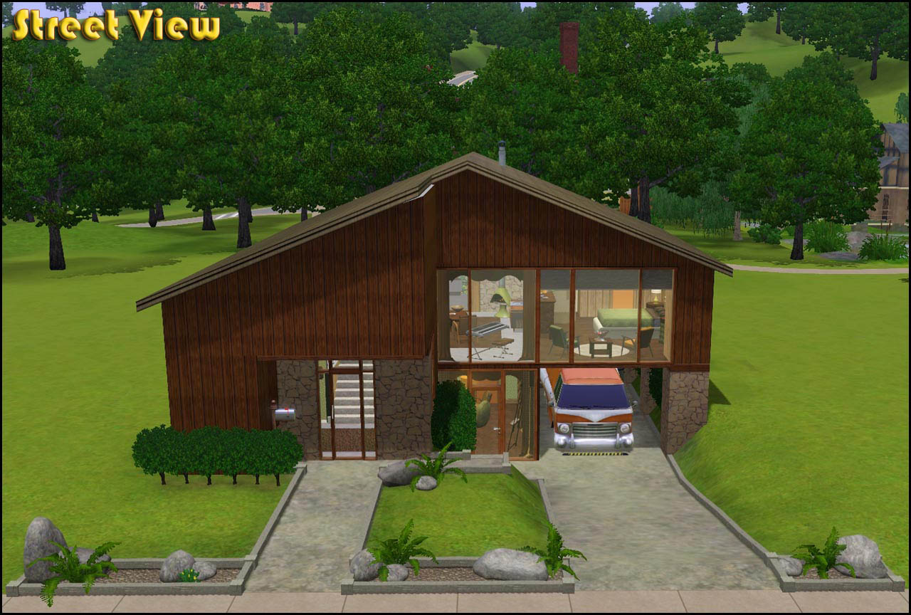
Here's an example of the plated ceiling with good ceiling height and color choice. It uses interior walls and does not over use brown. This was made by Blur.


also here is an exterior of a modern house. Try to follow the principles of this as it pertains more to an actual modern style. It uses dark brown accent to stand out against the white, don't be afraid to get past the monotone browns. It does not divide floors with plates, and has peaks filled in correctly. This was made by me.


Overall i feel this build needs a lot of work but as a structure it has a solid design.
4/10


« Last Edit: February 03, 2015, 12:26:21 AM by The Brighter Dark »

im sorry but as an engineer im offended by that roof design

Something seems off with it, but I can't put my finger on it. Maybe something with the roof?
Actually, the more I look at it, the roof isn't the problem. It's actually a pretty ingenious way of watering the flowers on the roof without having to go out there; just let the rain do it for you.

Actually, the more I look at it, the roof isn't the problem. It's actually a pretty ingenious way of watering the flowers on the roof without having to go out there; just let the rain do it for you.

bingo bongo

This is not an attempt, this is a success!

This is not an attempt, this is a success!

did you have to bump this.
like honestly