most of the suggestions i have are relatively minor and just from my own experiences of trying to create a professional online portfolio
i think your font choice detracts from the level of professionalism you're trying to achieve
architect's daughter and especially amatic SC are intentionally wavy, "silly" fonts that, to me, make it feel like the website i'm about to enter is a photographer taking portrait photos for an elementary school. just removing the CSS that has those fonts through inspect element seems to revert to futura pt, which isn't great, but is a little better.

i'd suggest a sans-serif font that's fairly wide. maybe
montserrat, maybe
raleway, maybe
quicksand... idk,
take a look around.
the front page is nice, i think an "enter site" button is fine. you're a photographer, so you want to put your best foot forward and have your work presented to a client straight away, and the background of this page is doing that. definitely put one of your best looking pictures here.
i would say you should get rid of your title being the first thing you see, or reduce it to "photographer" and put it in small text under your name or something. i'm assuming a link to this site will mostly fall into the hands of people who already know that you're doing photography, but i think a more blank entry page gives a viewer a larger incentive to enter and try to figure out what it is that you do. you also aren't immediately proclaiming yourself to be a "professional photographer," because even if you qualify as that, it's usually wise to avoid saying it until someone reaches your about me page. yknow, humility and all that
this is just a suggestion: since you're talking photos in several different "genres" (people, sports, animals, nature, city, etc.) you could turn your home page into several presentations of your work top to bottom that are just big links to other sections of the site. same thing as your other pages, basically. this also gives you an excuse to use parallax. here's what i'm talking about:
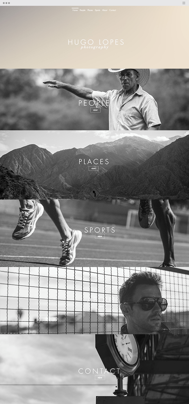
i wish i could link this site but it doesn't seem to exist anymore. also, i should note that if you did change your home page this way, you might actually look for a slightly different format for the other pages, since they look very much like this already.
on another note:

all six header buttons are usually one next to the other, but it doesn't take much page size changing to get buttons to sit on top of each other. it's not that bad, and after the page gets just a little narrower it turns into a hamburger menu which is all nice and good for mobile, but i've seen a fair bit of site design and this usually looks more like an accident than on purpose. idk what squarespace will let you change, but if you reduce the size of these buttons enough, you can avoid that stacking

again, just mentioning humility, get rid of "amazing." you can talk about your thoughts or motives for making a personal photo series, that's fine and i think it personalizes the site in a good way, but keep in mind that you're letting the person visiting your site decide whether your work is high quality or not
other than all that: i like the about page, i like how your work is presented in tabs. and i really like this photo in particular

good stuff


