Author Topic: Clock's RotB App - Ascetic's Home (update 1)  (Read 2892 times)

New updated pictures.
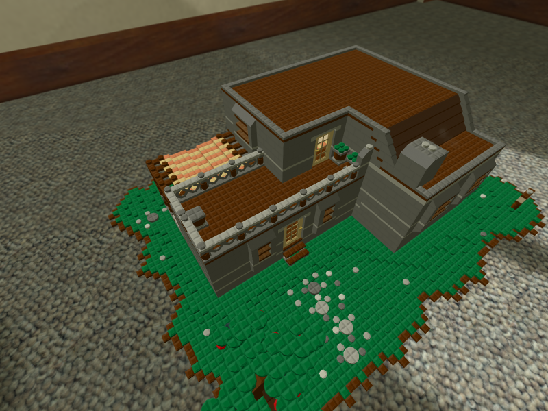
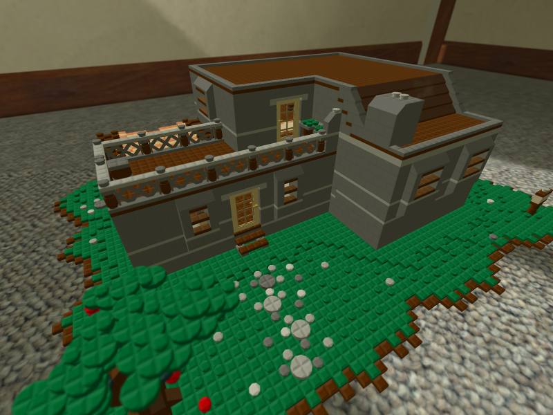
Exterior, top view.

Exterior, front view.

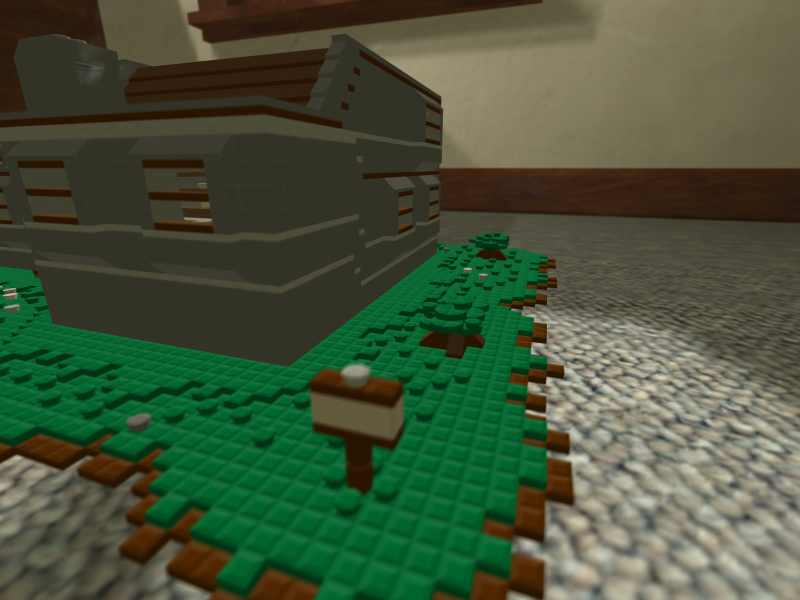
Side, with sign and two shrubs now.

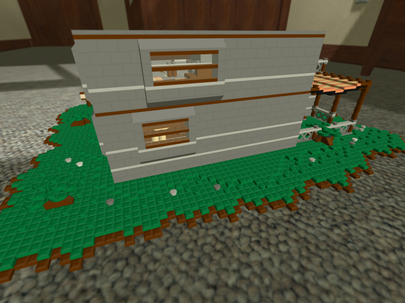
Back, showing the awning over the yard now.
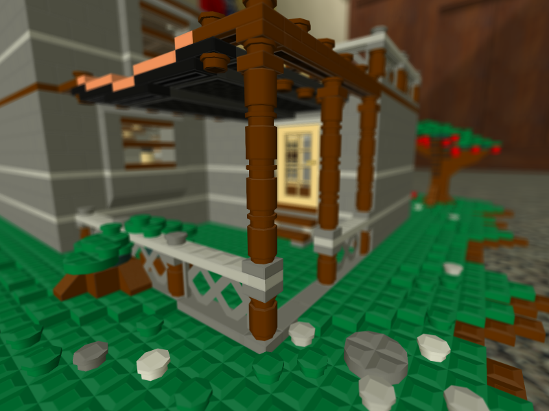
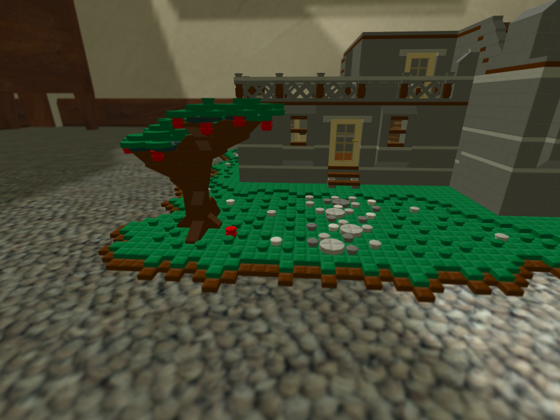
Yard, closer view.

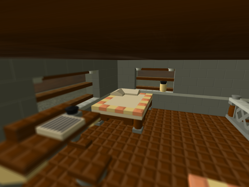
New bed, with new pillow and some thickness.

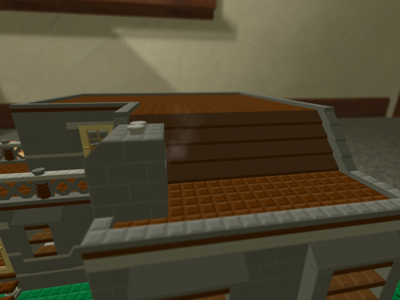
Chimney with new smoke.

Another outside view of the top, I don't think I meant to take it but it's there so now it's here and I posted it.

Uhh, stuff. New brickcount is 3606. It has an apple tree, because I like apple trees. And a few other things. Not many other things will be updated after this, but I might do more in this style. Maybe with some snow...

Looks like a nice house. Good job Clock.

Kind of a weird shape, and the interior (especially the upstairs) seem... odd.
But, better than I could do and overall more good than bad.

Looks a lot better, hope you get in-- This is Khorde by the way.

I like the tree you added, good design. I like how you did the bindings of the books, but the shelf itself doesn't seem appropriate for what I assume is an entrance hallway. It would be better suited in the main room or bedroom. I'm not sure about the gray/brown color scheme. It makes it looks more like a castle/keep than a house. The desk with paper and ink is great, but the bed is mediocre. There's too much empty space along many of the walls, try adding more furniture or wall designs.
« Last Edit: September 17, 2008, 11:40:44 AM by Otis Da HousKat »

After thinking about, I would like to see something else you've made
(Just to see you're other styles, if you have any others.)
so please post another build by you, it'd be wonderful!

I like what you added. Looks a lot better, good job!

I like the tree you added, good design. I like how you did the bindings of the books, but the shelf itself doesn't seem appropriate for what I assume is an entrance hallway. It would be better suited in the main room or bedroom. I'm not sure about the gray/brown color scheme. It makes it looks more like a castle/keep than a house. The desk with paper and ink is great, but the bed is mediocre. There's too much empty space along many of the walls, try adding more furniture or wall designs.
I'll try to keep all that in mind if I can find space alongside the enormous amounts of anime.

After thinking about, I would like to see something else you've made
(Just to see you're other styles, if you have any others.)
so please post another build by you, it'd be wonderful!
I have another WIP (far larger than this) that I'll probably be posting in about the next three to four days unless something goes horribly wrong. I believe most of it is sitting about on the dedicated, or was while it was on Slate if you've changed back.

Kind of a weird shape, and the interior (especially the upstairs) seem...odd.
But, better than I could do and overall more good than bad.

@Sirrus: Wow, your smart. not really.
 On topic thats is a fine shape and is creative good job

Little on the small side, but I like your style. Good luck Clock :D