I'm not going to negate anyone's opinions here because I don't know any of y'all or your current skills/experiences/etc, so what I say here is entirely just my two cents, if it condrtradicts with your methods, whatever, everyone does art differently.
THAT BEING SAID.
I am a professional. No like seriously, I am in my third year at university as an art student studying graphic design (aka digital arts), and I'm going to give you a few pointers that aren't just "GET A BETTER ART PROGRAM" or "GET A loving TABLET" because forget you, those things are nice to have but they can't improve your art in anyway other than polish. With the right skill and patience, even MSPaint can be a loving masterpiece generator.

THIS WAS MADE IN MSPAINT.
Now, just to prove to you I know what I'm saying and I'm not just some dingus who draws those stuffty Garfield cartoons, here are a few of my pieces from drawing classes:
https://www.dropbox.com/s/7p74sj3wpvtx3wg/20131018_115511.jpghttps://www.dropbox.com/s/p5kt2vtvptzm1vo/20130911_114933.jpghttps://www.dropbox.com/s/eas6zei4u3w85r8/SSPX0109.jpgI showed you these for two reasons: one, I am qualified to talk about art as I am currently learning the skills required to be one, and two, even though these are some of my better works, they could always stand to improve. Every artist can always learn and improve, no matter what level they are on, forget people who tell you that you're not good enough, they are loving richards.
NOW, on the the advice. This is based entirely on your current art style so I'm going to talk about that, not a general sense of art or theory (because I'm assuming you know how to hold a pencil, how to observe things, how to measure an approximation, etc).
So drawing with a mouse can be messy, but then, I started out drawing with a mouse too and I'll tell you, after loving around with that stuff for a couple years, you can get pretty decent with it. I'd still take my tablet over a mouse any day, but then I'd also take a pen and paper over a tablet (which to some digital artists is heresy).
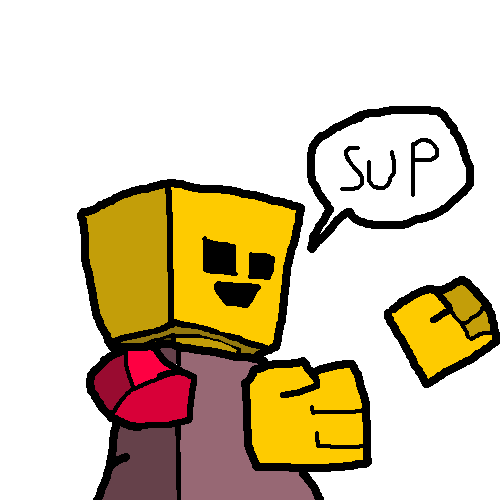
The first thing I'd suggest is that you're drawing some pretty simple shapes here, and that's a really good thing. You're making the mistake, however, of drawing directly into your piece without framing it out first. I'd suggest getting a basic program that does layers for the next bit because here's a really simply way to improve these shapes drastically.
(EVERYTHING I'M ABOUT TO DO I DID WITH THE JUST MOUSE, SO DO NOT TELL HIM HE CAN'T DO THAT)
Step 1So first thing is make a new layer and in a lighter cool color or a low value grey (the keyword here is contrast, you want to be able to distinguish between this line and others later) sketch out your drawing.
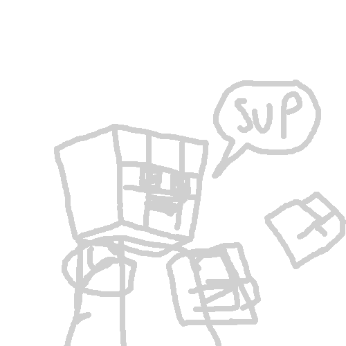
Now I do mean sketch here. Do not worry about details or mistakes, just draw over top of those. Use guidelines for everything. Line it up and keep it so everything is proportional. Proportions are the first step to making a figure of any kind look quality (unless the point is to warp our perspective, in which case there are always exceptions to every rule).
Keep this sketch brief, but make sure you include every detail you need for the later drawing.
Step 2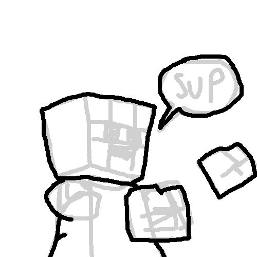
Using a new layer (and try your damnedest to make sure you don't forget which one you're drawing on), outline the figure in a relatively thick line.
The first thing I notice about your drawing style is you don't vary your line wight, and that can be a real drawing killer in terms of "better" (again, subjective term).
Only outline the figure, do not do internal detail yet!
Step 3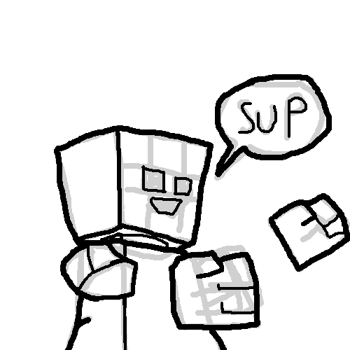
Using smaller points on the brush (my thick outline there was an 8pt, but these are 6pt and even 4pth for the small details) fill in the rest of the figure and his details.
I'm going to go into perspective and such later, but as a side note the trick to remembering how to properly use line weight is this:
Thicker lines usually indicate that something is closer to the viewer, thinner lines means it is further away. The thick outline always sets up a nice established white space for the eye to look at, and the thinner lines fill in the details. Basically what this does is it tricks the viewer into staring at your image longer so they can appreciate more of the detail, while also simulating our need to see depth in everything. We can interpret 2D as 3D in a drawing if you vary the line weight. You can trick us into thinking we're staring at something that's a full figure and not just a bunch of pixels.
Step 4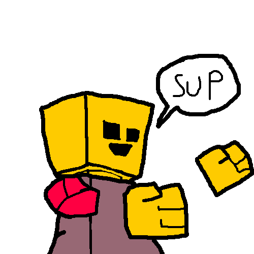
Just loving color that bad boy.
Use interesting colors. STAY THE forget AWAY FROM NEONS. Neon greens and yellows especially. If you want to go into the darks, don't go too far deep because then you won't be able to tell what's black and what's not. If you want something to appear new and shiney, use saturated colors and if you want it older or dirtier things, desaturate that bitch.
Side note: I didn't include a lot of stuff about color because color theory is a whole loving other tutorial, and it's really if you want to get super serious, for something like this you're fine just picking what suits your story best. There really are no right or wrong answers in color, there's just what looks appealing to the eye and what doesn't. If something is screaming "I AM TOO loving BRIGHT" to you, then its too bright and you need to turn that stuff down.
Also, this is another note about perspective that I don't go into, but there's this thing called atmospheric perspective, which basically means as something gets further away from you, the natural way light bends in our atmosphere combined with fogs or dust or whatever, it was get tinted slowly more and more blue until it fades into the color of the sky. So keep that in mind when we get to perspective in a few steps.
Step 5Now, as for shading.
Shading is important because it also helps with the whole depth thing. There are several ways to go about this, so I'll cover the most important two. (I'll go a little more in depth about light right after this, so sit tight).
The first method is the straight forward, if something is in shadow it is a darker version of the base color:
This one is pretty self explanatory. Just make sure you're always watching the light source. If light is coming from the left (the way the character is facing, not oriented on the page), then the right side of his face is in shadows and vice versa.
Also, highlights in this method are, in my opinion, recommended you stay away from them. Unless a white light is shining onto your figure and it's directly next to them, then you can highlight because that's appropriate. But in this type of art style, I've noticed highlights tend to look silly and/or make your figure about way too beveled and plastic, which even if you want that, that can really hinder how the art looks as a whole, so use that sparingly.
Step 6Now this one is the more interesting one, but it's also a bit more difficult, so if you find it's not working for you, I don't blame you for not picking it up right away. It's a bit confusing at first.
However, it's a hell of a lot more stylistic than the previous and can really up your ante in terms of mood and atmosphere in your drawing.
This is the warm light/cool shadows approach:
The idea is simple. You need two contrasting colors (two colors where one color is directly opposite of its counterpart on the color wheel)

.
Firstly, you need to identify your light source here, because unlike the first method, this one is a lot harder to cheat with and get away with it.
This method does require highlights, but they're necessary evils here (and they don't really bevel the figure though, so its cool).
Your shadows are to be a cool color (that's like blue or green) and your highlights should be a warm color (red or orange).

NOTE: You don't have to do it this way either. If you have your characters in a place where you want the atmosphere to be cooler and is thus giving off a cool light, you are perfectly well allowed to switch the method. Do cool highlights and warm shadows.
The difficulty of this method lies in remembering which way the light is coming from, because it's easy to accidentally paint something a cool color when it should be warm or warm when it should be cool. This method is really great for creating a subtle atmosphere, and you'll notice that they use it a lot in comic books:

You don't even need to color the whole figure as demonstrated above (if they're in a shadow, that is), just cool shadow warm highlights.
Step 7Identifying a light source is key here, but you also need to know about the light itself.
The point on your drawing where the light is emitting from determines the direction of the shadow, but the type of light determines how big the shadow should be.
If your light is a radial one (or is just close to the object) it will make really dark and really big shadows.
But, if it's a direct light or a spotlight (like the sun, by the way), it will make longer and thinner shadows.
The direction of the shadow is parallel to the direction of the light beam.
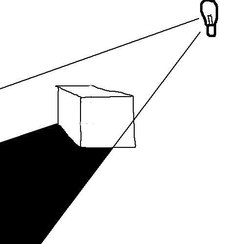
Step 8Finally, we get into perspective and depth. This is probably the most important aspect of your drawings that needs to improve, because you deal with a lot of cubes (your characters being blockheads and all).
This can be used for backgrounds as well, so keep this in mind when drawing something with detail.
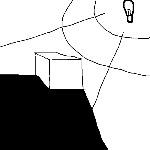
First you're gonna need to know at least one type of perspective, and the best one for beginning artists is one point. One point perspective is very simply this: you draw a straight horizontal line on the page, this is called the horizon line and is, as the name implies, the horizon of your scenery as well.
Now, somewhere on this line, pick a point off of it. Really, any point works so long as it is on the line. This is what's called the vanishing point:
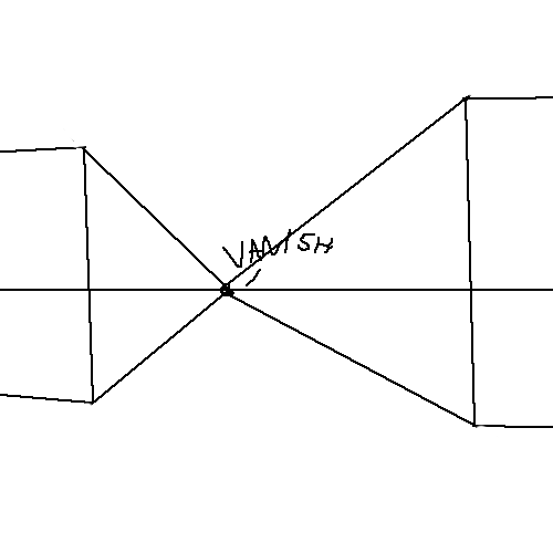
Every object you draw on the page must now adhere to this point. You cannot draw another point, everything must eventually "vanish" into this point.
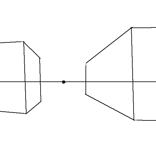
This is going to help tremendously with the way you render your blockheads. It'll give you a better sense of how a cube works. Now, I've been drawing for a great many years of my life and I've gotten to the point where I can freehand a cube pretty well (as you saw in my character sketch in the very first step), but even still I use this method if I'm drawing a cube (or really whenever I'm drawing something way more complicated) into a perspective I'm not really sure about. Perhaps I shifted the camera, perhaps we're looking at the blockhead from underneath him, or above him top down style.
This is going to greatly improve the realism and depth of your drawings (by now I think you've noticed a theme here). It'll make them far less sketchy and far more polished.
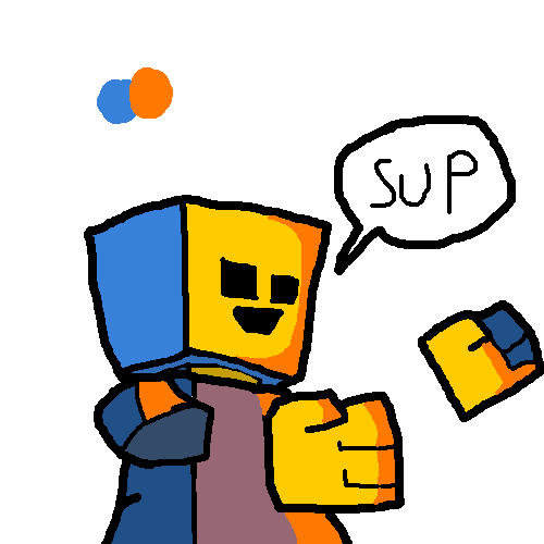
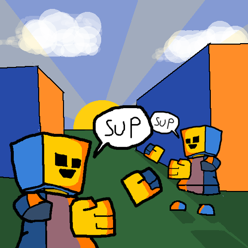
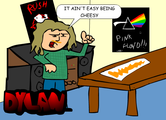
Step 9Now, combine everything and you should be able to get something like this:
Our final step is just some basic things I'll mention that can act as tips to further improve your drawings.
Notice I used overlapping here. It's very subtle (and it's happening to the speech bubble, but meh), but you can clearly tell that the larger figure is in the foreground and is not simply larger in size than the guy behind him. This is a good way to indicate depth if you ever feel like your characters look like one is a giant and one is a midget when really they're the same height just different positions.
Secondly, I really do suggest getting a program that can do layers but also one that does opacity and tints.
Doing something as simple as setting your brush opacity to 20% and dotting it around a spot at different wights can create those (semi) convincing clouds. The sun rays have an opacity of 20% as well, this saves me the time of having to go over my clouds with the colors and instead create that nice effect.
Take for example, in the latest page of Chivalry I used the opacity tool (and a lot of the methods I mentioned above) to create this landscape:
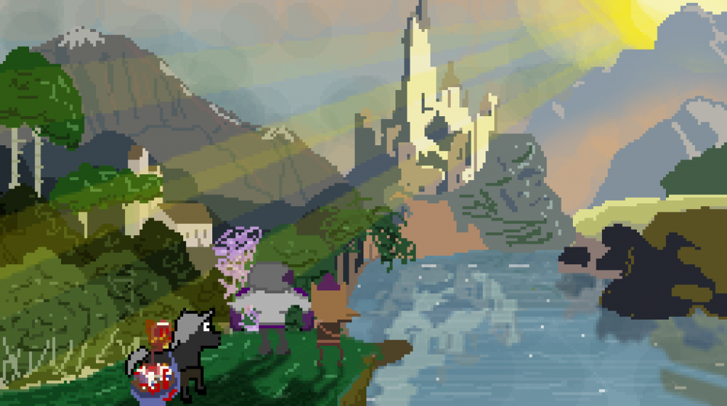
Sun rays, clouds, fog, reflections in the water, shadows. All of it just layers and opacity. Don't let anyone tell you you need "smooth" lines to achieve something cool. I want you to note also that these are done at pixel levels, so there is not very much room for detail so I had to be simplistic and use the above methods to full effect to capture that scene.
SO IN CONCLUSION:
You're doing stuff right already by just loving going at it, bro. There is no right or wrong way to do art, there's only these tools that you can pick up.
Talent, in my opinion, doesn't actually exist. I think every person on this earth is capable of doing really great art. The only thing they lack is the passion to improve their skills.
For example, here's a comic I drew in flash back in the eight grade:
And here's concept art for a character I was developing a few months ago:
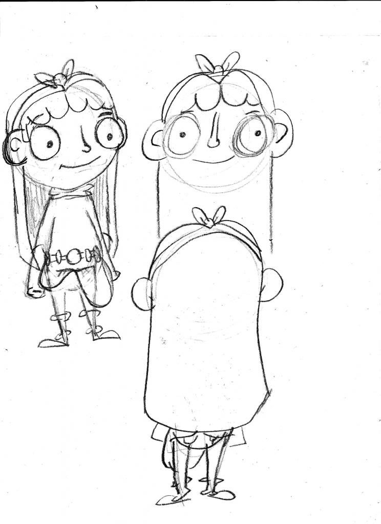
Sure, some people are going to say my art style is too cartoonish for them, and that's fine, because I
want to be a cartoonist. And you can't tell me that there wasn't a pretty damned good improvement there from the first image.
Even me, who can create that pixle art you saw, started out at a point of being amature. It was there, it just wasn't there there. You can make it there if you just keep practicing. And anyone on this forum who is a pretentious art snob can frankly suck a fat one and get bent. You loving draw until your fingers bleed even when they tell you its stuff, because even if you think it's stuff, its still your stuff, and you love making it, and that's what loving counts. And then one day, after practicing stuff, eventually its a loving diamond and you didn't even realize.
ALSO, TRACE. ART ASSES SAY NOT TO TRACE, forget THAT stuff. Find an artist you inspire to be like and trace their stuff. Learn the way they curve a line, feel the way they made a piece of work sing, experience it from their perspective and then, try drawing it from memory. Human beings are adapters, nothing else. There's an old adage that is "nothing is original," and you know what that's loving true. The only thing we can do as humans is put our perspective on stuff. We absorb everything we see since day one to better ourselves, and art is no different.
If you ever have any questions, if anyone on this forum has any questions, from someone who is actually planning on doing this for a living and is (I think anyway) pretty good at it and wants help with it, I will gladly help you.
Knowledge is important and anyone who won't share what they know to the future because they "don't have time for the peasants" is seriously just hindering our species.
You keep loving drawing, folks. You're only ever going to get better.


